MUMMY TEXT EFFECT
Step 1

This tutorial will explain how to use Repoussé inside Photoshop CS5 to create an amazing 3D text effect, without the need for any other 3D software. Many different material values will be modified to accomplish the final result, and some adjustment layers will be used to enhance the outcome as well. Let’s get started!
Tutorial Details
·
Program: Adobe Illustrator CS5 (You should be able to create this tutorial
in CS4 but some of the tutorial images might look different.)
·
Difficulty: Intermediate / Advanced
·
Topics Covered: Gradients, Appearance Panel
·
Estimated Completion Time: 1-1.5 Hours
Step 1
Create a new document
and type out some text with the Text tool (T). I used Museo Sans 900 but you can use whatever font you like. I
suggest starting with a bold sans-serif font to get the hang of the technique.
When you create the wrap effect it might be harder on a script of serif font
initially.
Step 2
Outline your text
(Command + Shift + O) and fill it with a linear gradient. Change the first
color stop to a muddy green color, change the second color stop to a darker
muddy green color, and change the Angle of the gradient to -90.
Step 3
Now we got the base
text, let’s start creating the mummy fabric. We are going to take this one
letter at a time, so let’s focus on the first letter of your text. WIth the Pen
tool (P) create a strip shape that covers a small portion of the letter. Make
sure the shape overlaps the letter a little.
Step 4
Take off any stroke on the strip and fill it with a linear gradient. Add one more color stop to the gradient so you have a total of three color stops. Change the first color stop to a gray color, the second color stop to white, and the third color stop to a gray slightly lighter that the first gray. Change the Location of the first middlepoint to 28 and the second middlepoint to 87.
Step 5
For this next gradient
we are going to use a linear gradient with numerous color stops to create the
fabric folds. With the strip shape selected, add a New Fill from the pop-up
menu of the Appearance panel. Make sure you are working on the top layer and
fill it with a linear gradient. Add six color stops to the linear gradient
giving you a total of eight. Change the fill of the color stops in this order:
white, gray, white, white, gray, white, gray white. Change the Angle of the
gradient to -90. This next part is slightly tricky but we need to adjust the
color stop locations and middlepoints to create the effect of fabric.
Basically, we want the gray color stop to end more abruptly when blending into
the white color stops, so drag the white color stops following the gray color
stops really close to the gray color stops. Take a look at the image below to
see what I am talking about. Next, open the list items in the Layers panel for
the eight color stop gradient and set the Blending Mode to Darken.
Step 6
Create a new fill from
the Appearance panel and fill it with a light gray color. With the new fill
selected in the Appearance panel, go Effect > Texture > Texturizer. In
the Texturizer dialog, change the Texture to Brick, the Scaling to 200 and the
Relief to 50. Next, set the Blending Mode of the texture fill to Overlay at 12
percent opacity.
Step 7
To give it a little
more depth let’s add a drop shadow. We want to add it to the whole shape and
not an individual fill, so select the “Path” at the top of the list in the
Appearance panel. Once selected go Effects > Stylize > Drop Shadow. In
the Drop Shadow dialog, change the Opacity to 40, the X Offset to 0, the Y
Offset to 1 px, and the Blur to 1 px.
Step 8
That is basically it
for the creating the texture. Now comes the tedious part, creating all the
strips and applying the effect. The nice part is we can create a Graphic Style
to apply to all the strips. To create the Graphic Style, simply select the
strip we already created and press the New Graphic Style button in the Graphic
Styles panel.
Step 9
Now create a bunch of
other strip shapes with the Pen tool around the first letter. When creating the
strip shapes alternate the stacking order so some are on top and some are not.
Next, select all the strips and apply your new Graphic Style to them. It’s
looking pretty good but we need to adjust some of the gradients of the
individual strips to add a slight variance from strip to strip. An easy way to
this is to reverse the eight color stop gradient in some of the strips.
Moreover, adjust every strips eight color stop gradient with the Gradient tool
(G) so the Gradient Tool’s Fill Path (the line connecting the Start Point and
End Point of the gradient when the Gradient Tool is active) is parallel with
the shorter sides of the strips.
Step 10
After you have
finished the first letter, move on to the rest and create the strip shapes,
apply the graphic style, and adjust each individual strip. It can get tedious,
but the results are worth it. When creating the strips really think about how
they actually would wrap around the form of a letter. If you are wrapping a
elliptical shape, the strips would be thinner as the reach the axis of the
elliptical shape. Also, think about how the strips would wrap around sections
of letters like “t”. You might just have to play around until you get something
you like (that’s what I did), even still, you probably will get some funky
pieces. Another tip is to always adjust the gradient so the gradient Fill Path
is parallel to the shortest side of a strip. For example, the eight color stop
in the “e” is going a different direction compared to the first strip we
created because of how it is positioned.Once the strips are ready, group each
individual letter together, making it easy to move and rotate each letter.
Final Image
Here is the final
image again. I adjusted the text to be a little closer together and created a
background following the techniques from the Seamless Textures Tutorial from about a month ago.
3DTEXT

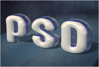
This tutorial will explain how to use Repoussé inside Photoshop CS5 to create an amazing 3D text effect, without the need for any other 3D software. Many different material values will be modified to accomplish the final result, and some adjustment layers will be used to enhance the outcome as well. Let’s get started!
Tutorial
Assets
The following assets were used
during the production of this tutorial.
Enabling
OpenGL
The Repoussé will not work unless
OpenGL is enabled. So go to Edit > Preferences > Performance, and make
sure Enable OpenGL Drawing (under GPU Settings) is checked.
Also, go to Edit > Preferences
> 3D, and make sure OpenGL (under Interactive Rendering) is enabled.
Step
1
Create a new 1024 x 768 px document,
or whatever size you need depending on the text you’ll be creating. Then, set
the Foreground color to #4a4f65 and the Background color to #161a28, and fill
the Background with a Radial Gradient (from the center to one of the corners).
Open the More Grunge vi texture then go to Image > Adjustments > Levels, and
change the Shadows value to 70 and the Gamma value to 0.70.
Go to Image > Adjustments >
Hue/Saturation and change the Saturation value to -60.
Step
2
Place the texture on top of the
gradient background layer and change its Blend Mode to Overlay, then resize it
as needed.
Create the text in All Caps using
the font Mousou Record G
and the color white. The size is 255 pt, and the Tracking value is set to 100
to create more space between the letters.
Step
3
Go to 3D > Repoussé > Text
Layer. A dialog box will appear telling you that this will rasterize the type
layer, and you will no longer be able to modify your text. So if you are sure
you don’t need to modify your text, click yes and continue.
Under the Repoussé Shape Presets,
choose Inflate Sides. Then, under Extrude change the Depth to 0.1, under
Inflate change the Angle to 100 and the Strength to 0.05, and under Bevel,
choose Front from the Sides drop down menu, set the Height to 30, the Width to
6, and choose the Cove – Deep Contour.
This will create the basic 3D shape
of the text.
From the Toolbox, use the Camera
Tools to change the camera (view) angle, as we don’t want to change the mesh’s
position. Once you select the Camera Tool, you can click and drag to change the
values, or you can simply use the 3D Axis to do so. And if you want you can
enter some exact values in the Options bar Orientation fields.
If you don’t see the 3D Axis you can
get them by clicking the “Toggle misc 3D extras” icon down the 3D panel, then
check the 3D Axis option.
You can save the camera position as
well, by clicking the “Save the current view” icon in the Options bar then
entering a name for the view. The saved view will appear down the View drop
down menu in the Options bar.
Step
4
Now its time to apply the materials
for each side of the mesh. First, you need to open the 3D panel (Window >
3D), then click the little arrow to the left of the mesh’s name to expand the
materials list.
Select the Front Inflation Material
to start modifying its values. First you need to get rid of the Diffuse texture
if there is one. To do so, click the Diffuse texture icon, then choose Remove
Texture. You’ll need to do the same thing for the other materials as well, as
the texture might hide any applied colors.
Once you remove the texture, change
the Reflection value to 25, the Illumination color to #323232, the Gloss to
80%, the Shine to 80%, the Specular color to #e7e7e7, and the Refraction value
to 1.46.
Click the folder icon next to
Environment then choose Load Texture and add theBokeh Texture. This texture will appear in the reflective areas of the
material.
Click the Environment texture icon
then choose Edit Properties, and make sure that the U Scale and V Scale are set
to 1, and the U Offset and V Offset are set to 0.
Step
5
Select the Front Bevel Material,
then change the Diffuse color to #006ddc, the Opacity to 30%, the Reflection to
30, the Illumination color to #002a5f, the Glow to 95%, the Shine to 70%, the
Specular color to #fcfcfc, the Ambient color to #0042b4, and the Refraction to
1.768.
Select the Extrusion Material, then
change the Diffuse color to #d4d3d2, use the Bokeh texture for the Environment,
change the Reflection to 10, the Illumination color to #323232, the Glow to
80%, the Shine to 70%, the Specular color to #e7e7e7, and the Refraction to
1.25.
Step
6
Click the “Toggle the misc 3D extras”
icon down the 3D panel and check the “3D Light” option, and you can check the
“3D Ground Plane” as well. This way you can see how the 3D lights are
positioned in the scene.
Scroll down
under the Materials to select the lights. Use the Light Tools to move the
lights around if you want, again, by clicking and dragging, using the 3D Axis,
or just typing in the values in the Options bar.
- Infinite
Light 1: Make sure that the Intensity is 0.5.
- Infinite
Light 2: Make sure that the Intensity is 0.4.
- Infinite
Light 3: Make sure that the Intensity is 0.3.
You should
get a result similar to this. Make sure that the lights are not super bright or
too low.
Step 7
Click the
pop-up menu arrow in the top right corner of the 3D Panel, then click the
Ground Plane Shadow Catcher option, so that the shadows will be rendered
without the need to create a surface to catch them.
Click Scene
at the top of the 3D Panel, then choose Ray Traced Final from the Quality drop
down menu.
This might
take a couple of hours, but this is what the rendered scene should look like.
Step 8
Once the
rendering is finished, pick the Rectangular Marquee Tool and draw a 80 x 322 px
rectangle in any empty area, but try to keep the selection centered vertically.
You can check the measurements in the Info panel (Window > Info), or you can
create a Fixed Size selection.
Create a new
layer below the 3D layer and call it “Gradient”. Set the foreground color to
#56d4df and the Background color to #208dad, pick the Gradient Tool, choose the
Foreground to Background gradient, and click the Reflected Gradient icon in the
Options bar. Then, click in the center of the selection and drag to one of the
sides.
Go to Select
> Deselect to get rid of the selection. Then go to Filter > Blur >
Motion Blur, set the Angle to 90 and the Distance to 500.
Duplicate
the Gradient layer then move the copy a bit to the right.
Step 9
Select both
Gradient layers, go to Layer > Merge Layers, then duplicate the new merged
layer. Make the copy merged layer invisible by clicking the eye icon next to
it.
Make sure
that the visible Gradient layer is selected (active). Press Ctrl/Cmd + T to
enter the Free Transform Mode, then press the Ctrl/Cmd key and move the corners
of the gradient to create an illusion of a 3D background for the text.
You might
need to move the four corners to get the result you want. Once you’re done hit
Enter/Return to get out of the Free Transform Mode. Make the copy Gradient
layer visible again.
Do the same
thing for the copy Gradient layer, except this time you’ll need to adjust it
vertically so that it is perpendicular to the original Gradient. After that,
merge the two gradient layers, and rename the merged layer to “Gradient
Background”.
Step 10
Click the
Create new fill or adjustment layer icon down the Layers panel and choose
Hue/Saturation, and change the Hue value to 19 and the Saturation value to -50.
Make sure
that the adjustment layer is below the 3D layer so that it affects all the
layers except for the 3D text layer.
Step 11
Set the
Foreground color to #cbf6f4 and pick a 30 px soft round brush, then create a
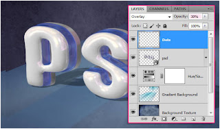
new layer on top of all layers, call it “Dots”, and change its Blend Mode to
Overlay.
Start adding
the bright dots along the blue part of the text.
Go to Filter
> Blur > Motion Blur, set the angle to 0 and the Distance to 10.
Change the
“Dots” layer’s Opacity to 30%, or any other value you like depending on how
bright you want the dots to be.
Step 12
Click the
Create new fill or adjustment layer icon and choose Photo Filter, then select
the Warming Filter (81).
Click the
Create new fill or adjustment layer icon once again and this time choose
Gradient Map. Then change the adjustment layer’s Blend Mode to Multiply and the
Opacity to 70%.
Click the
Gradient box to assign the gradient colors.
Only two
colors are used, the color #6fb3b3 to the left, and white (#ffffff) to the
right.
Make sure
that the adjustment layers are on top of all layers. They will intensify the
final effect colors and make them more vivid.
Final Image


Nice Tutorial......
ReplyDelete